
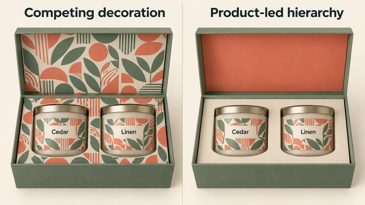
AI-assisted concept cover. Open the cover at full size.
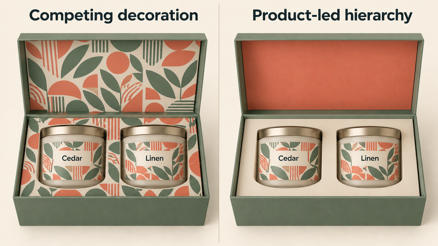
A gift box works best when its outside and inside have clear, different jobs. Use the exterior to establish the brand and occasion. Use the opening moment to add a new detail. Then give the product enough visual space to become the focus. Printing every available surface can make those stages compete with one another.
The right balance depends on where people first encounter the box, how it opens and what the product already looks like. A bright illustrated product may need a quiet interior. A restrained product can sit comfortably within a more expressive reveal. Start with that relationship rather than choosing a long list of finishes.
Start with the view your customer actually sees
A closed gift box on a retail shelf has a different assignment from one delivered inside an outer shipping carton. On the shelf, the visible lid or front panel may need to communicate the brand and collection immediately. Inside a shipping carton, the gift box can offer a quieter first introduction because the recipient has already made the purchase or knows a gift is arriving.
Write down the first three views: closed box, newly opened box and product ready to lift out. For a lift-off lid, the lid may leave the scene entirely. For a hinged box, its interior can remain behind the product. A message placed inside a removable lid therefore behaves differently from the same message on a hinged panel. Explore gift-box structure directions alongside your graphics so the opening and visual story develop together.
Tiffany provides a useful example of sustained exterior identity: its official account describes the blue box and white ribbon as signature elements of its gift presentation. The transferable idea is to make a few brand elements work consistently across occasions; the color and styling themselves belong to Tiffany. Tiffany, The Tiffany Blue Box
Choose a leading surface
Give one surface the strongest visual treatment. It might be a large illustration on the lid, a contrasting inner panel or a richly colored tray around a simple product. The remaining surfaces can support it through repeated color, spacing or a small motif.
This does not require a plain exterior. A patterned box can have an equally considered interior without repeating the full pattern everywhere. For example, one shape from the outer illustration could become a small inner-lid detail. That creates continuity while leaving the product area open.
MOO’s account of its Business Cards+ packaging shows this distinction clearly. Its exterior used angular forms, a neon accent and subtle surface detail, while the interior was designed to let the cards take prominence, supported by a small presentation mechanism. This is a documented design example, rather than evidence that a particular visual treatment produces higher sales. MOO, Box Clever: Packaging Just Went Plus
Match the visual balance to the job
Use these directions as starting points for your own design. None is inherently more premium than another.
Scroll horizontally if columns extend beyond the view.
| Presentation goal | Outside emphasis | Inside emphasis | Main trade-off |
|---|---|---|---|
| Recognizable year-round gift | Brand color and one clear mark | Quiet background around the product | Relies on a distinctive core identity |
| Surprising reveal | Restrained exterior with a small cue | Contrasting color or one illustration | The inner design must actually be visible |
| Collection storytelling | Collection artwork on the main panel | Short supporting message | Too much copy can delay the product reveal |
| Product-led presentation | Small brand detail | Minimal graphics and deliberate spacing | Product arrangement must carry the image |
A useful decision question is: if the recipient remembers one image from opening this gift, should it be the box exterior, the message or the product arrangement? The answer helps you decide which element deserves the strongest contrast.
Let the product determine the interior
Design the inside with the product present. A white insert that looks elegant in an empty mockup may visually merge with a pale product. A dark insert can frame a light object, but it may also compete with dark labels or obscure fine details. A repeated pattern can look lively on an empty panel and become distracting behind several small jewelry pieces.
Consider the visible insert as part of the composition. Its shape, color and uncovered area influence where the eye goes. A large amount of printed decoration underneath an opaque product contributes little to the first reveal. That space may be better left visually quiet, with the main design moved to a panel that remains visible.
Paper itself can contribute texture and tone. Fedrigoni’s Paper Box presentation brings together natural, colored and coated papers in several surface finishes. It illustrates the range designers can explore, without establishing which paper is suitable for any particular gift box. Fedrigoni, Paper Box collection announcement
Give every message a reason to be there
Separate the jobs of brand name, gift message and product guidance. The brand name establishes identity. A short greeting can accompany the reveal. Care or use information needs a location where it can be read and retained.
If all three compete on the inner lid, reduce the greeting to one sentence and move longer information to an appropriate card or product component. Avoid adding copy merely because a panel is empty. A generous blank area can make the remaining message easier to notice.
The opening sequence also affects tone. An inner-lid line is addressed to someone actively discovering the product. It can be warmer and more immediate than the exterior collection name. Read it aloud while opening a rough mockup to see whether it fits that moment.
Before and after with the same two candles
Imagine a candle brand reviewing a hinged sage gift box containing two cylindrical candle jars. Each jar has a cream label with a detailed botanical illustration. The insert has two round cavities, one for each jar. This is a hypothetical design exercise, not a Packrivo customer project.
The first concept repeats botanical artwork across the inner lid and exposed insert as well as the product labels. To judge the effect of the graphics, keep the physical setup identical in both versions: the same box, the same two jars, the same labels and the same round-cavity layout. Changing the products or photographing one version empty would make it harder to assess the design decision.
Scroll horizontally if columns extend beyond the view.
| Element | Before | After | Decision |
|---|---|---|---|
| Exterior | Sage box with a small botanical motif | Same sage box and small motif | Keep the exterior identity |
| Candle jars and labels | Two cylindrical jars with cream botanical labels | The same two jars with unchanged labels | Keep the product artwork |
| Product arrangement | Two jars side by side in two round insert cavities | Same positions, spacing and round cavities | Keep the physical layout |
| Inner lid | Detailed botanical pattern repeated from the labels | One solid warm coral field, without the repeated pattern | Change the background to one color |
| Exposed insert | Botanical artwork surrounding both jars | Plain neutral cream around the same jars | Remove competing decoration |
| Main detail at the reveal | Botanical detail on three visible layers | Botanical detail concentrated on the product labels | Give the labels more visual separation |
The revised direction keeps the brand’s botanical character on the products and a small exterior cue. A single coral inner lid adds contrast when the hinged box opens. The neutral insert provides an uninterrupted background around the labels. The decision is about how the composition reads; no measured conversion or sales effect is claimed.
Compare both assembled versions at the same angle with the lids equally open. Check that the labels remain easy to notice and that the coral does not overwhelm the actual jar colors. If the brand wants the interior illustration to be the main event instead, it can retain that leading surface and simplify another one. The table makes the trade-off explicit rather than treating a quiet interior as a universal rule.
Bring a visual intention to the conversation
You can begin with three simple sketches and a sentence describing what each view should communicate. Include the actual product appearance and identify the surface you want to emphasize. Materials, print methods and construction can then be explored around that direction.
Build a packaging brief with Packrivo to discuss your gift box, preferred visual balance and open design questions. Packrivo helps organize packaging sourcing and project coordination; final production options depend on the project and relevant supplier.
Sources and scope
All sources accessed 6 October 2026. Design recommendations, the decision table and the candle example are original editorial synthesis. The example is hypothetical. These sources do not establish Packrivo production capability, pricing, certifications or customer outcomes.
- Tiffany, The Tiffany Blue Box: original brand account supporting the example of a recognizable exterior identity and signature ribbon. No Tiffany color, logo or packaging artwork is proposed for reuse.
- MOO, Box Clever: Packaging Just Went Plus: original designer account supporting the contrast between an expressive exterior and product-led interior in that specific packaging project.
- Fedrigoni, Paper Box collection announcement: paper manufacturer’s description supporting the availability of varied paper colors and surface textures within its collection, not their suitability for a proposed Packrivo project.
- Packrivo gift-box directions: verified live category link supporting exploration of different gift-box construction directions.
- Packrivo packaging brief: verified live internal CTA destination; describes a scoped inquiry and confirms that production capability, price, quantity and delivery require confirmation.
Check whether the chosen message is visible at its intended moment
Keep the original two-candle before/after comparison and its Cedar/Linen artwork unchanged. Add a separate visibility record for that hinged-box direction: closed, first reveal and after jar removal. The new diagram is a symbolic visibility map, not another product redesign or an attention experiment.
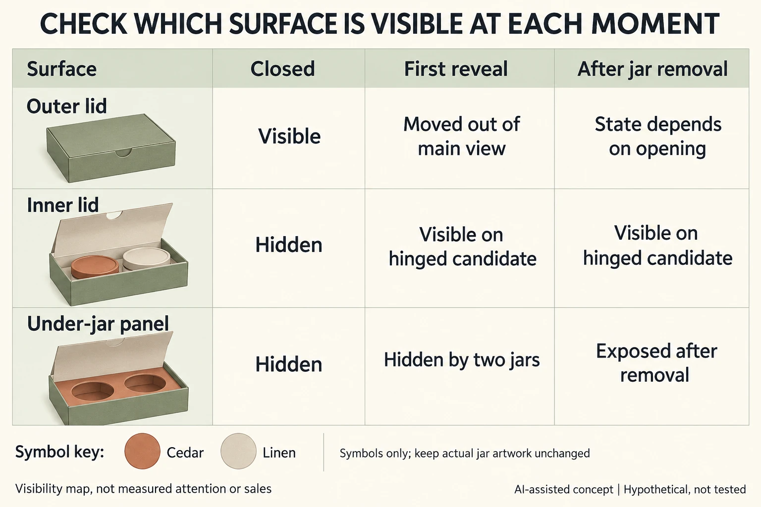
Scroll horizontally if columns extend beyond the view.
| Surface | Closed | First reveal | After removal |
|---|---|---|---|
| Outer lid | Visible | Outside main interior view | Depends on opening/view |
| Inner lid | Hidden | Visible in hinged direction | Visible in hinged direction |
| Area under jars | Hidden | Covered by two jars | Exposed after removal |
| Care/message content | Position to identify | Must match intended reading moment | Not automatically found |
A message intended to introduce the gift cannot rely on an area hidden beneath opaque jars at the first reveal. If the team wants a later discovery instead, name that moment deliberately. This is a visibility question, not a rule that every hidden surface should remain unprinted.
The circles and small box symbols are not replacements for the original jar artwork, color or cavity geometry. Compare actual assembled artwork candidates with the same two jars, lid angle and viewing position, and record any occlusion before choosing the leading surface. The CSV leaves actual observation and approval blank. No scan rate, preference, cost saving or sales outcome follows from the map.
Download the gift box design inside and outside record (.csv). HYPOTHETICAL rows are invented examples. Use ACTUAL_BLANK for permitted project inputs; replace that row label only when recording actual facts. Empty evidence, observation and date fields mean unknown or not performed, never acceptance. Keep checkpoints and revisions separate.
Send the unchanged product arrangement, actual opening/viewing states and the specific surface meant to carry the first or later message. Packrivo coordinates independent suppliers. These records establish no supplier offer, service availability or MOQ exception; its published baseline is 500 pieces per product/design.