
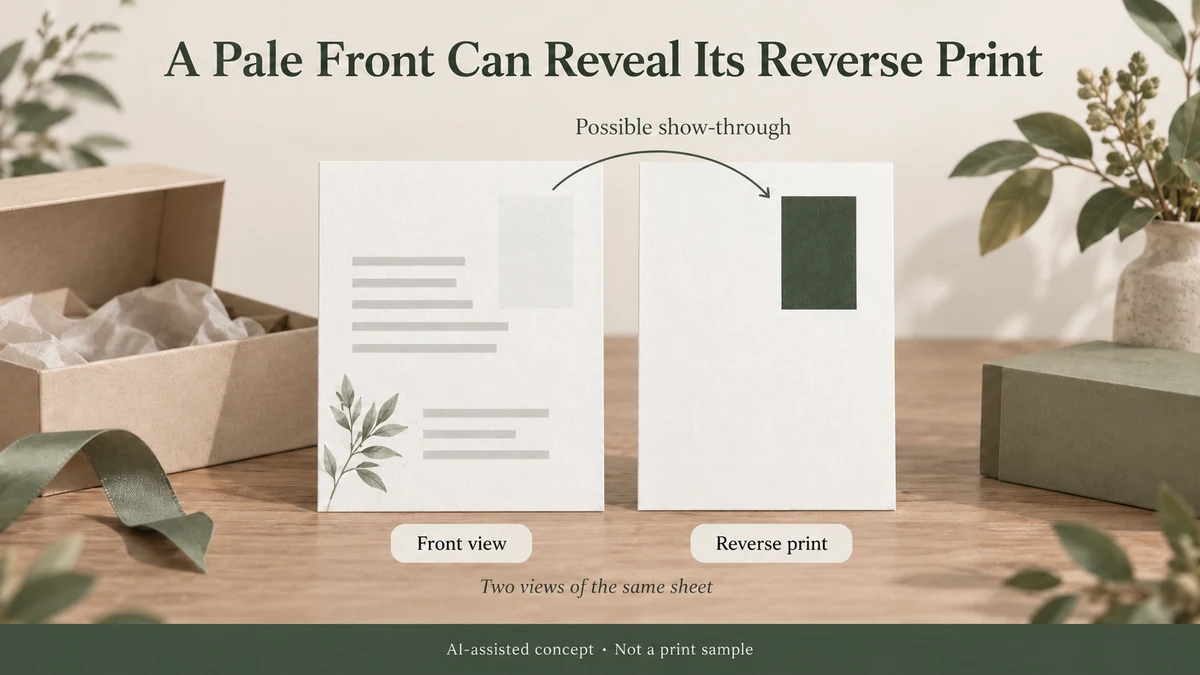
If a dark graphic printed on the back of a care card appears as a faint shadow through its pale front, the answer is not necessarily darker front artwork or a different white paper.
For an Informational insert card, send both printed faces, the proposed paper grade and the actual backing used during the review. The product concept does not establish opacity or remove the need to compare the finished two-sided proof.
The first question is whether the proposed sheet hides its reverse-side printing well enough for the way the card will be used.
Reverse-side show-through can be an optical effect. The ink may remain on the side where it was printed while its image still affects what someone sees from the other side. A screen proof cannot establish how much of that image will be visible through the actual paper.
For a jewellery, candle or gift brand choosing a two-sided card, that distinction changes the decision: review the paper’s opacity, the relationship between front and back artwork, and the backing against which the finished card will be seen before changing the front colour.
Reverse-Side Printing Can Be Visible Without Ink Reaching the Front
Paper is not necessarily a complete optical barrier.
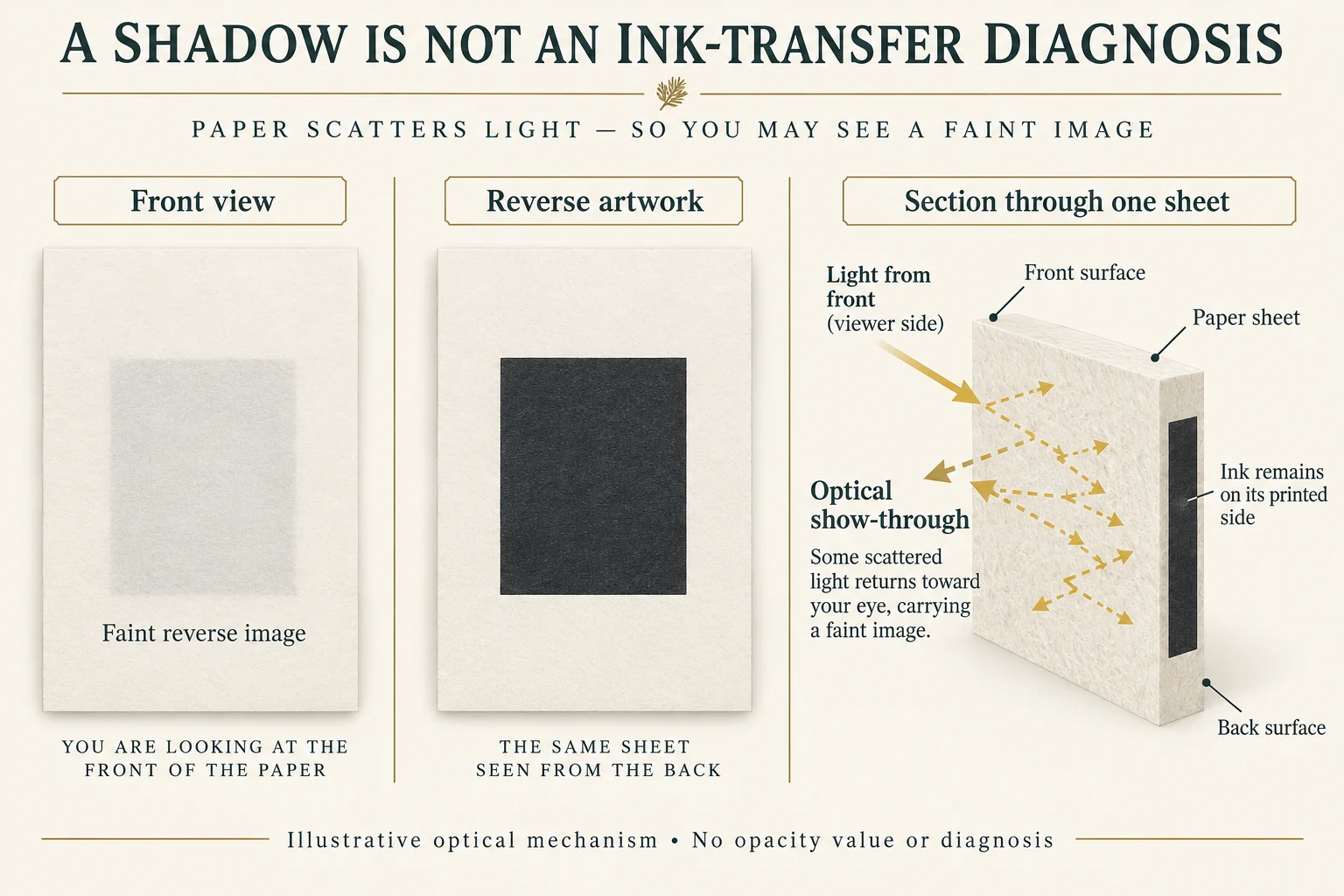
When a printed sheet is viewed under reflected light, some light can enter and scatter within the paper. The printing and background on its far side can influence the light returning toward the viewer.
If the sheet does not sufficiently conceal a dense reverse-side graphic, a faint version of that graphic may become visible through a lighter area on the front.
This is optical show-through. It does not, by itself, demonstrate that ink has travelled through the sheet.
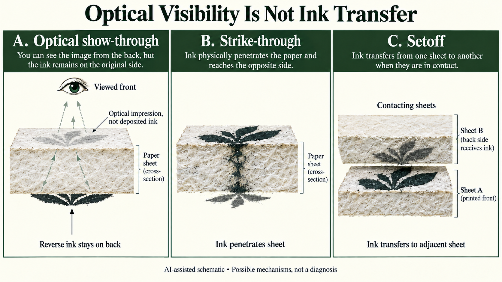
That matters because three different mechanisms can produce superficially similar complaints.
Optical show-through concerns the visibility of printing through the paper even when the printed ink remains on its intended side.
Ink strike-through involves ink penetrating the paper structure sufficiently to affect its opposite side. This is a physical ink-and-substrate question, not simply a lack of optical hiding.
Setoff involves ink transferring by contact to another sheet or surface. An image on the back of an adjacent sheet after stacking therefore raises a different question from seeing a graphic through the same sheet.
A visible shadow cannot establish which mechanism occurred. If ink penetration or surface transfer is suspected, the printer needs to investigate the physical evidence and the relevant printing process rather than classify the problem from a photograph alone.
For a proposed card that shows a faint outline aligned with its own reverse artwork, however, opacity is a legitimate question to investigate before assuming a wet-ink defect.
Whiteness and Opacity Describe Different Paper Properties
A sheet can look bright and clean without concealing everything printed behind it.
Holmen’s General Technical Information separates opacity from CIE whiteness, ISO brightness and colour.
Its opacity section describes a measurement principle that compares reflectance from one sheet over a black background with reflectance from an opaque stack of paperboard samples. The result is expressed as a percentage.
The principle concerns how much the material hides what is behind it.
Whiteness describes the visual impression of a near-white surface. ISO brightness concerns blue-region reflectance. Neither measurement is interchangeable with opacity.
This means choosing a paper simply because its sample looks whiter does not establish that it will better conceal reverse-side printing.
It also means a supplier’s opacity figure should not be treated as a completed readability assessment for a particular care card.
The public description of ISO 2471:2008 identifies a diffuse-reflectance method for determining paper-backing opacity. The fourth edition was published in December 2008 and was last confirmed in 2023.
The public scope permits certain papers containing fluorescent whitening agents when the specified ultraviolet adjustment is made. It excludes coloured papers or boards incorporating fluorescent dyes or pigments.
Those distinctions matter when interpreting an actual supplier’s reported method. The public abstract does not give a universal minimum opacity for two-sided care cards, and the paid full standard was not consulted for this article.
A higher opacity value under a specified comparable method may be useful when assessing material alternatives. It still cannot guarantee that a dense reverse graphic will be unobtrusive behind the particular pale area of a finished card.
Reverse Artwork and Intended Backing Affect Visibility
A material’s opacity is only part of the finished appearance.
Consider a care card with a large dark brand mark on the reverse and a nearly unprinted ivory area on the front.
The dark mark creates a stronger visual contrast behind that pale area than a small, lightly printed line might create.
Moving or reducing the reverse mark could change the visible interference without changing the paper. Alternatively, retaining that artwork might make a different paper proposal worth investigating.
Neither change is automatically the right choice.
The backing also matters.
A care card displayed flat against the inside of a gift-box lid may not look identical to the same card held alone during unboxing. A light backing, dark backing or neighbouring material can change the amount and contrast of light returned toward the viewer.
An opaque stack of sheets is not equivalent to a single loose care card.
Before comparing samples, decide which presentation actually matters. If the customer will remove and read the card in their hand, a favourable appearance while it rests on a pale box lining cannot settle the loose-card question.
If the card is permanently mounted, the actual backing belongs in the proposed construction and its appearance review.
The useful target is not an abstract demand for perfectly opaque paper. It is sufficient concealment of the actual reverse artwork under the viewing conditions that matter to the finished product.
A Hypothetical Two-Sided Care Card
Suppose a small gift brand is developing a near-white care card.
The front contains a short set of care instructions, surrounded by generous pale space. The reverse has a dense, dark rectangular brand mark.
In the artwork file, the rectangle sits almost directly behind the palest part of the front design.
A screen proof shows each side clearly. It may confirm the artwork placement, but it cannot reproduce the optical interaction of two printed faces separated by a real paper sheet.
The brand requests a physical duplex proof using the proposed grade.
For illustration only, suppose the printer supplies that proof and the brand observes the following:
When the card is held loose under the intended reading light, a faint rectangular shape is visible in the pale front area. When the same card rests on its intended light-coloured packaging backing, the shape is less distracting.
These are invented observations for this example, not reported test results.
The brand now has a defined design question.
If customers normally receive the card loose, the favourable backed appearance does not resolve the problem. The brand still needs to judge the card in the loose viewing condition.
If the reverse rectangle can move away from the pale front area without compromising the design, the printer could prepare a comparable duplex proof with that layout change.
Keeping the proposed paper grade and front artwork unchanged would help the team investigate the effect of the reverse artwork arrangement.
If the rectangle must remain in its current position, the next useful request may instead be an alternative paper grade with relevant opacity documentation and another complete duplex proof.
A front-only print on the same proposed stock could also provide a useful visual reference. It would not replace the duplex proof, but it could help clarify how the reverse printing changes the front appearance.
None of these comparisons is an ISO opacity measurement or a diagnosis of ink penetration.
Their practical value is that the buyer can distinguish a possible artwork-layout solution from a material-selection question instead of changing several variables at once.
Choose the Change That Addresses the Visible Problem
A paper change, artwork change and backing change are different responses.
If the problem is concentrated where one dense reverse graphic overlaps a pale front panel, reconsidering that overlap may be more relevant than changing every front colour.
If the reverse design and card format must stay unchanged, a paper with different documented opacity may be worth comparing. The material supplier or printer must confirm the proposed grade, its relevant properties and its suitability for the printing process.
If the design depends on a particular backing, review the full printed arrangement against that backing. Do not assume the same appearance when the card is removed.
If the printer finds physical ink on a surface where it should not be, the investigation moves beyond opacity toward ink penetration or contact transfer, depending on the evidence.
These choices do not establish a universal preferred grammage, coating or opacity percentage. Increasing paper weight, choosing a brighter white or introducing a finish without examining the actual result would substitute a material assumption for the unresolved visual question.
The decision should be expressed through the intended finished appearance: the required front information remains readable, and reverse-side artwork does not create objectionable interference in the specified viewing arrangement.
Compare one variable in a care-card opacity review
Give the front artwork, reverse artwork and proposed grade separate references. A front-only reference, duplex proof held loose and the same duplex proof on the intended backing answer different questions. Keep the actual light, orientation and viewing arrangement with each observation.
| Planned comparison | Keep unchanged | Question it isolates |
|---|---|---|
| Front-only versus duplex | Grade, front artwork and viewing arrangement | Does the reverse image affect this front view? |
| Loose versus intended backing | Same duplex candidate and light | Does the backing change the visible interference? |
| Revised reverse layout | Grade and front artwork | Does moving the dark object resolve the located overlap? |
These are proposed comparisons, not completed findings. If the printer identifies actual deposited ink on the wrong face or on another sheet, retain that physical evidence separately. An opacity document and this visual record cannot diagnose strike-through or setoff from a photograph alone.
Download this article’s project record (CSV). The record includes field definitions, labeled teaching examples and a blank project row. Add source evidence and the details of your actual project.
For a sourcing discussion, send the two artwork faces, proposed paper grade and the actual backing/viewing question. Packrivo coordinates supplier questions; the responsible technical or commercial parties confirm the actual method, configuration and terms.
Review the Complete Two-Sided Card Before Changing Its Colour
A physical duplex proof answers something a screen image and a blank paper sample cannot: how the chosen front and reverse artwork appear together through one actual sheet.
The review should preserve the distinction between the optical visibility of reverse printing and evidence of ink physically moving to another location.
Packrivo’s guide to reviewing artwork on proposed uncoated paper covers broader artwork-element and substrate-proof questions. The narrower question here is whether the same sheet adequately conceals the reverse artwork in its intended use.
Packrivo can coordinate questions about proposed paper grades, duplex artwork, supplier documentation and the scope of physical proofs. Any technical measurements, process diagnosis or material acceptance criteria must be established with the responsible printer or material specialist.
A brighter-looking care card is not necessarily a more opaque one. Resolve the reverse-side visibility question before revising the front design to hide a symptom.
Source review: 10 October 2026. Holmen’s online technical collection is undated and describes its paperboard product context. ISO 2471:2008 is the fourth edition, published in December 2008 and confirmed in 2023. Its public description was reviewed; the paid eight-page standard was not read. Neither source establishes a measured result or universal acceptance limit for the hypothetical care card.