

Choose foil, embossing or spot UV by the effect you want the recipient to notice. Compare the same final-size artwork on the intended material, then request evidence for the chosen appearance. A reflective mark, a change in board relief and a local gloss area create different design questions.
View the full-size planning illustration
Start with one focal element. Adding several finishes before deciding their purpose makes it harder to judge which treatment contributes to the presentation. The first useful output is an effect choice and a defined proof request.
Give the finish a visible or tactile job
Describe what matters when the package is seen or handled. You might want a wordmark to catch light when a sleeve tilts, a mark that can be felt, or gloss that appears against a quieter surrounding surface. Each description gives the supplier a clearer comparison than a request for a premium finish.
Foil can provide a metallic or pigmented decorative area, depending on the offered material and process. The FSEA foil reference distinguishes named hot, cold and digital routes. Ask which route is proposed instead of treating every metallic-looking effect as the same production instruction.
Embossing and debossing change surface relief. Spot UV places a coating in selected areas; a raised coating is a separate proposal whose actual height and detail need identification. PakFactory's option library illustrates these finish categories as converter terminology, not a promise that every effect suits your board or order.
Keep the intended interaction narrow. A tactile brand mark doesn't automatically make the whole package accessible, and a glossy patch doesn't establish resistance to wear. Appearance, handling and any performance requirement need their own review.
Compare candidates without changing the artwork and stock
Use the same final-size mark when comparing effects. A large foil title on smooth white stock and a tiny blind emboss on textured board change several variables. A preference between them doesn't identify which finish would work on your actual design.

Name the substrate or wrap, any underlying print and the surface layers. If the material remains a proposal, keep that status with the candidate. Ask for comparable samples or swatches that make their differences clear rather than treating every item in a sample book as interchangeable.
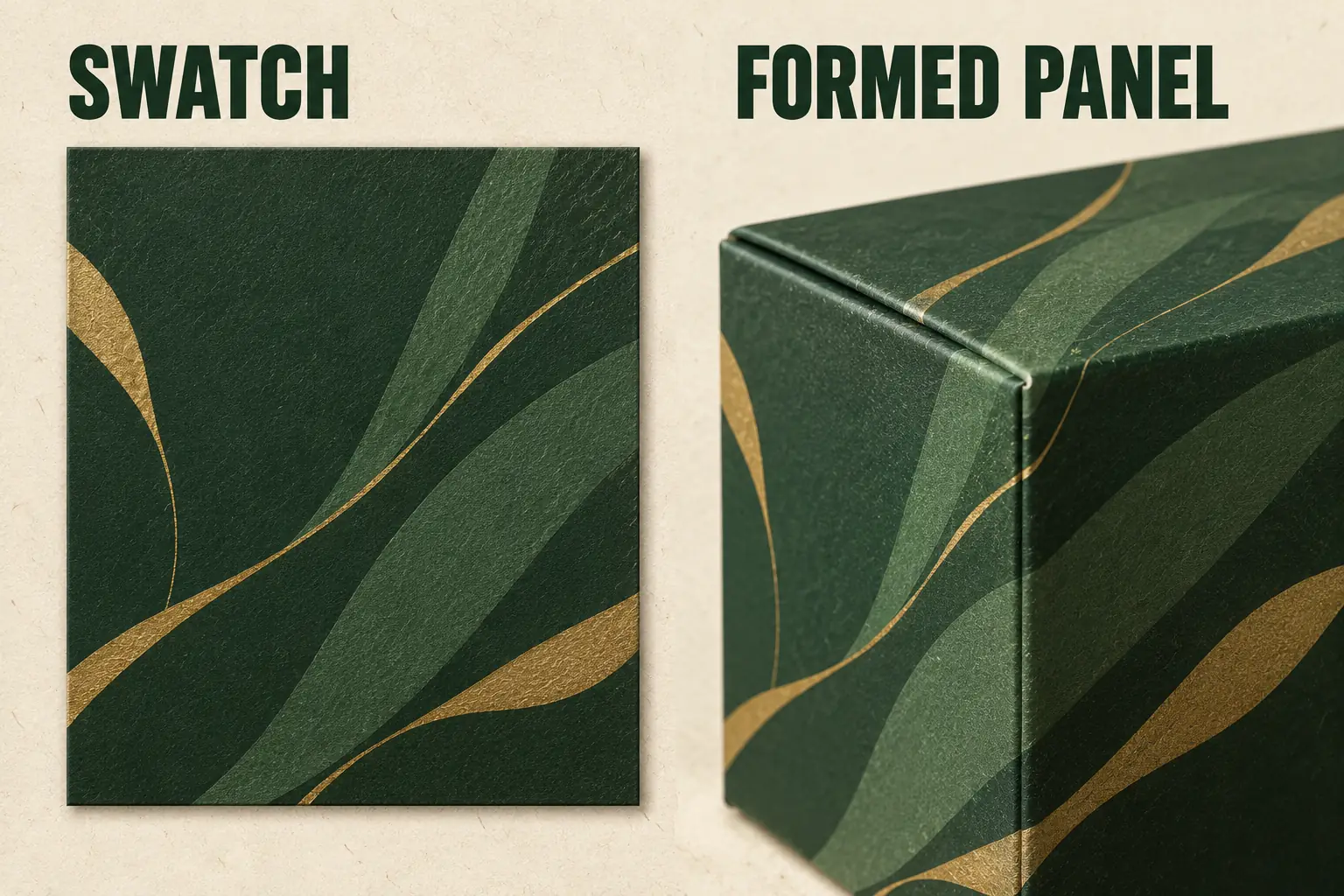
The location matters too. Show the mark on the proposed panel, with nearby folds, cuts, glue areas and closure features identified. A surface effect chosen on a flat swatch may need another review once it crosses a formed interface.
For a folding carton, include the formed panel. For a rigid magnetic jewelry box, keep the wrap, lid and opening arrangement in the comparison. The same visual ambition can require different questions on those constructions.
Use an effect comparison that leads to a decision
Record what each candidate is intended to do and the evidence still needed. Avoid assigning a universal ranking for luxury, durability or cost.
Scroll horizontally if columns extend beyond the view.
| Direction | Intended effect | Evidence to compare |
|---|---|---|
| Foil | A selected reflective or colored decorative mark | Actual foil reference, detail and appearance on the offered surface |
| Emboss or deboss | Raised or recessed relief | Front detail, reverse-side effect and nearby contact |
| Standard spot UV | Local gloss against the surrounding surface | Coverage, boundary and registration on the proposed print |
| Raised UV | A tactile coating above the surface | Named offered construction, detail and handling review |
Write a short preference after comparing candidates, including the material and artwork size. Selecting a swatch color doesn't approve a logo's final registration, and selecting relief doesn't confirm clearance behind the embossed panel.
Keep a simpler printed alternative in the comparison when it could meet the same design objective. That provides a deliberate choice rather than a second finish added because the first one hasn't been evaluated clearly.
For relief, look behind the decorated surface as well as at the front. Identify whether a card, insert or product will meet that area after forming. A preference based on an isolated embossing sample leaves that contact question open. Include the proposed location before accepting the appearance choice as suitable for the complete pack.
Work through a finish-choice planning example
Planning example: one proposed cream sleeve carries a single front wordmark. Its design objective is for that mark to catch light as the recipient turns the gift. Two candidates are requested on the same chosen stock: a foil treatment and a local gloss treatment. No samples or quotations have been obtained for this example.
The comparison keeps the artwork size, panel position and surrounding print unchanged. Record face-on appearance, appearance at an angle and the intended hierarchy beside the product name. If touch becomes a separate objective, add a relief candidate and state why it is being considered.
A large showroom foil sample might help choose a color direction, but it doesn't answer whether the small wordmark remains clear. Ask for evidence at the actual size. If the mark must align with printed outlines, identify that registration relationship before choosing the next proof.
The example ends with a request, not a claimed winning finish. The preferred direction should be supported by the compared material and evidence. It should also name what remains open, such as the offered process, setup or final physical sample.
Match physical and digital evidence to their questions
A screen mockup helps discuss hierarchy and placement. A physical swatch helps discuss a particular surface appearance. A formed sample helps reveal interactions with folds, edges or the opening. Keep those roles separate when reviewing the proposal.
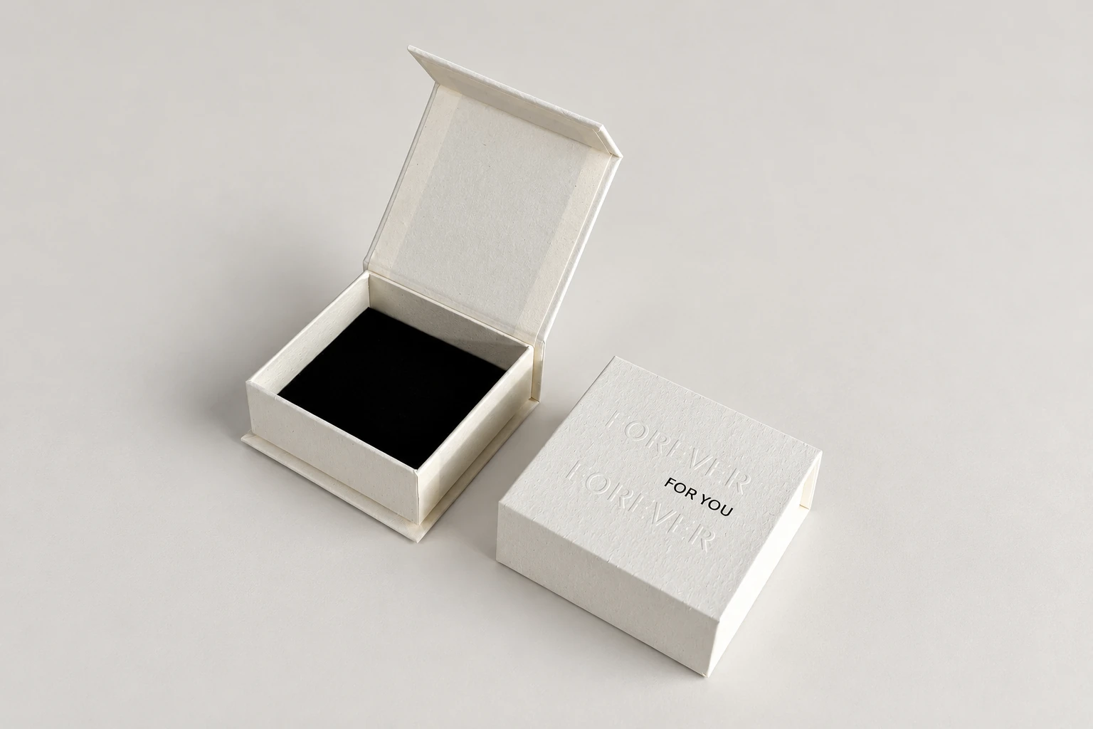
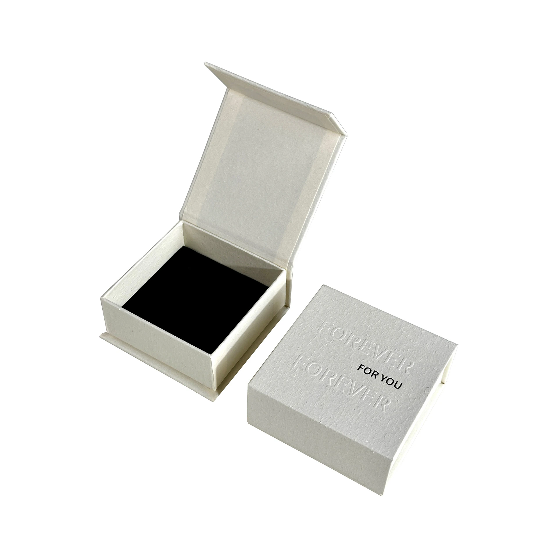
Adobe's separations documentation describes what its preview can show and where further printer verification is needed. A software view cannot reproduce every physical finish condition. Ask the selected printer for the actual file and proof requirements.
For combined effects, name the contribution of each. Foil aligned with relief introduces a relationship that neither isolated sample approves. Ask which evidence addresses the combined result and retain the exact artwork and material references.
Carry the choice into one finish instruction
Once the effect is chosen, use the finish specification guide to locate it and prepare the production handoff. That later task records the panel, file, process proposal and proof owner; it shouldn't reopen the basic visual choice without a reason.
Keep the selected sample or swatch reference beside the current drawing. A later change to board, artwork size or position can reopen the affected comparison even when the requested finish name stays the same.
Send the intended effect, actual-size artwork and open proof question through a packaging finish inquiry. A specific visual objective gives the supplier something concrete to assess while the physical result remains subject to review.