
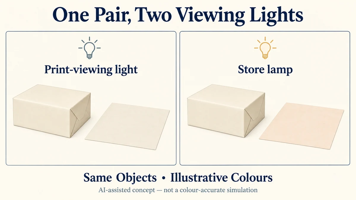
A cream gift box and its tissue may look like a coordinated set under a printer’s viewing light but noticeably different under a shop lamp. Neither component has to change for that to happen. Changing the light can change how each material appears—and can change the visible relationship between them.
A Printed Tissue Sheet: Plan the Fold and Product Contact is a relevant component when the same gift includes printed tissue and a box. Compare those actual substrates and finishes together under the selected viewing conditions; matching screen colours do not approve the physical set.
For a jewellery, candle or gift brand, the practical decision is where the packaging colours need to work together. A satisfactory match in one agreed viewing environment does not establish a match in every environment where the finished set will be seen.
Different Light Can Break an Apparent Colour Match
A box wrap and a tissue sheet can produce similar perceived colours under one light even though their underlying spectral properties differ. When the illumination changes, those differences may become visible.
This is the principle behind illuminant metamerism. The CIE International Lighting Vocabulary, 2020 edition, defines metamerism in terms of spectrally different colour stimuli producing the same tristimulus values in a specified colour system. In practical colour matching, a metameric pair can appear to agree under a reference illuminant and separate when that illuminant changes.
The important distinction is between the appearance of each component and the relationship between the two.
If both cream components look warmer under a different light but still coordinate, their overall appearance has changed without necessarily creating a new mismatch between them.
If the tissue looks distinctly pinker than the box under the second light, even though they looked alike under the first, the pair has developed a visible difference that matters to the packaging design.
That observation is consistent with possible illuminant metamerism. It is not, by itself, proof of the technical cause.
The physical samples remain unchanged during this comparison. What changes is the light reaching and reflecting from them. The CIE’s colour stimulus function definition describes the relationship between a source’s spectral distribution and the reflecting properties of an object.
This is why matching a named cream colour on two different materials is not automatically the same as matching their appearance across different lights.
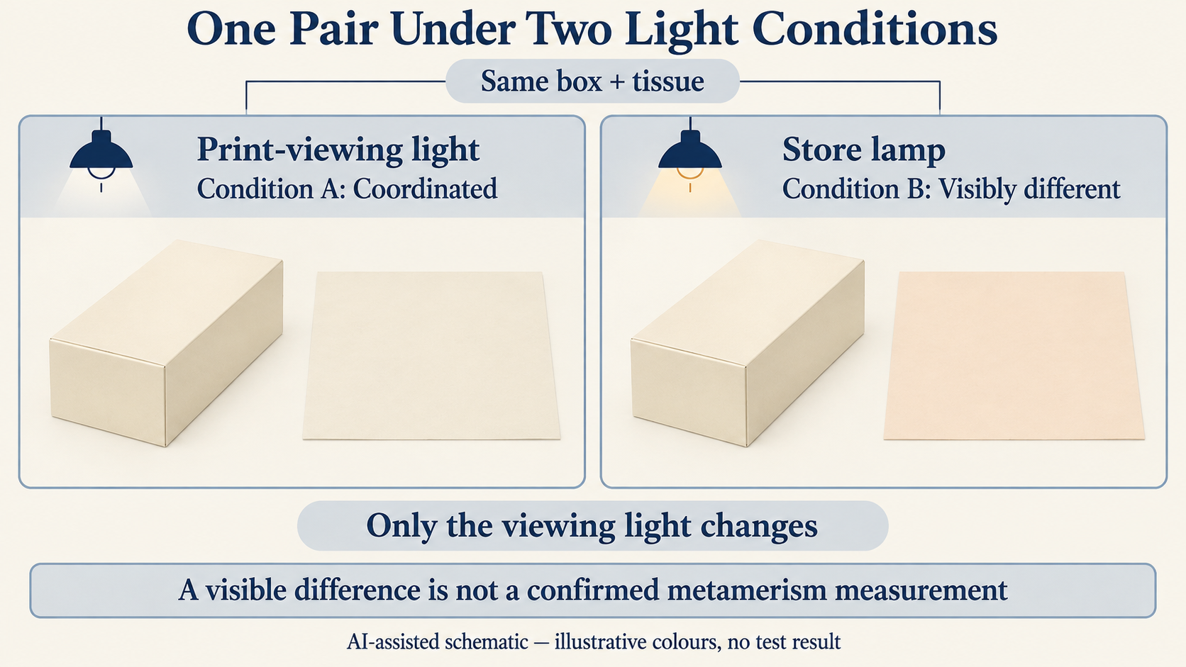
The Viewing Environment Depends on Where the Set Is Seen
A controlled print-viewing condition gives a buyer and printer a shared place to compare physical colour. It is useful precisely because the conditions can be specified rather than left to chance.
The public scope of ISO 3664:2025 covers viewing conditions for reflective and transmissive images, including critical comparison of prints and appraisal at illumination levels resembling practical use. Its controlled-viewing framework does not establish that a packaging pair will also match under a particular retail lamp.
For a jewellery gift set displayed open in a boutique, the lighting over the displayed box and tissue may be important. For an online candle brand whose packaging is mainly opened in customers’ homes, the unboxing environment may be more relevant. A gift set photographed for a campaign introduces a separate image-production question, but its photograph should not replace a physical comparison.
Select the environments from the way customers actually encounter the packaging.
If both shop display and home unboxing matter, a print-viewing comparison alone cannot close the cross-light appearance question. The brand must decide whether it requires close coordination in both settings or can accept a different colour relationship in one.
A Standard Illuminant Is Not Every Real Lamp
CIE standard illuminants specify spectral distributions for colour calculations. The CIE’s public description of ISO/CIE 11664-2:2022 explains the intended uses of D50 and D65. These named reference distributions help specify a comparison; the actual viewing light remains a separate physical condition.
They should not be treated as universal substitutes for the lighting inside every shop, studio or home.
A lamp described as 3000 K or 4000 K is not fully specified for colour-matching purposes. Correlated colour temperature describes a characteristic of a light source’s chromaticity; it does not identify its complete spectral distribution. The CIE definition of correlated colour temperature makes that distinction clear.
Two different lighting systems can have similar nominal colour temperatures while producing different colour-rendering behaviour for particular materials.
When a specific store environment matters, identify the actual source or representative lighting arrangement rather than assuming that a Kelvin label completely describes it.
A Hypothetical Cream Box and Tissue Comparison
Consider a hypothetical small jewellery brand preparing a gift set with a cream paper-wrapped box and cream tissue.
Both proposed components are reviewed beside each other under an agreed print-viewing light. The buyer judges them visually coordinated. This is an illustrative observation, not a reported sample result or measured colour match.
The same box wrap and the same tissue are then viewed together under a specified lamp used in the intended store display. Nothing is reprinted, replaced or retouched.
Under that second light, suppose the tissue appears more peach-coloured than the box wrap. The brand wanted a restrained near-match, so the new contrast is distracting.
The question is not which component has suddenly become the wrong cream. It is whether the proposed pair meets the intended appearance requirement in the store environment.
To make that comparison meaningful, both pieces should be exposed to the same identified light during each viewing, with their relative position, backing and viewing geometry kept as consistent as practical. Tissue translucency and the way the sheet is layered can also affect its visible appearance, so the arrangement should represent its intended use.
The two conditions should be compared separately, without uncontrolled mixed lighting making the result difficult to interpret. A reviewer should allow for visual adaptation and should not use a phone photograph as the final comparison.
In this hypothetical example, the result is:
- Under the agreed print-viewing light, the pair appears coordinated.
- Under the identified store lamp, the pair appears insufficiently coordinated for the brand’s stated purpose.
No spectral reflectance data, numerical colour difference or universal pass/fail tolerance is implied. The observation creates a specific design and sourcing question, not a laboratory diagnosis.
The Response Depends on the Required Colour Relationship
The brand has several meaningful choices.
If the retail presentation depends on a close cream-to-cream match, the store-light difference needs further review. The buyer can ask the responsible printer or material supplier whether an alternative ink, substrate or material combination could better maintain the intended relationship across the selected lighting conditions. Any proposed alternative still requires relevant physical comparison; its success cannot be assumed.
If the tissue only needs to complement the box, deliberate contrast may be more practical than attempting a near-identical cream on two different surfaces. A visibly lighter or contrasting tissue can be an intentional design decision rather than an unsuccessful attempt at exact matching.
If one environment matters more than another, the brand can prioritize that environment, provided the limitation is understood. For example, the brand might prioritize its principal retail display and accept that the two components may look less alike in some home lighting.
None of these choices guarantees uniform appearance under every lamp. The useful output is a defined visual objective for the real environments that matter to the product.
This decision is different from choosing the physical reference itself. Packrivo’s physical colour approval guide addresses reference ownership and the agreed sample. A multi-light comparison asks whether that selected pair still achieves the desired visual relationship when illumination changes.
Not Every Lighting-Dependent Difference Is Metamerism
A visible change between two settings does not automatically establish illuminant metamerism.
A screen or camera can alter a colour comparison through display behaviour, exposure, white balance or image processing. Two photographs made under different lights do not isolate the spectral behaviour of the physical materials.
Gloss and surface texture introduce another complication. A laminated box wrap may produce directional reflections that an uncoated tissue does not. If the appearance changes mainly with viewing angle, specular reflection or surface geometry may be involved. Such a difference should not be described as proven illuminant metamerism merely because a lamp was moved.
Fluorescent materials, including some optical brighteners, add a further consideration. Their response can depend on ultraviolet content as well as visible illumination. The CIE’s public description of ISO/CIE 23603:2024 distinguishes visible-range and ultraviolet-range methods when assessing daylight simulators using defined specimen pairs.
That standard concerns the quality of daylight simulation. Its published description is not an acceptance certificate for a finished packaging pair.
If the cause matters technically, a qualified printing or colour-measurement source may need to evaluate the relevant material properties and viewing or measurement conditions. A visual comparison alone cannot identify reflectance spectra, fluorescence behaviour or a formal metamerism index.
Nor does one colour-difference number, without its illuminant and other measurement conditions, establish that two physical materials will coordinate in another light.
Define the Match Across the Conditions That Matter
Before choosing a coordinated box, tissue and label, describe their intended relationship in the settings where they will be viewed together.
A print-viewing condition can remain the common reference for a printing decision. A second viewing environment can answer whether the proposed components continue to achieve the brand’s desired appearance at display or unboxing.
If the same unchanged pair looks coordinated in one light but separates in another, the brand has learned something useful even before identifying the technical mechanism. It knows that a single-condition visual match is insufficient for its particular design objective.
Packrivo can help coordinate sourcing questions about proposed materials, print finishes, physical references and the viewing evidence that a supplier may be able to provide. A responsible printer or specialist must establish any required technical measurement method, material changes and acceptance criteria.
A colour match made under one light is a result for that viewing condition—not a promise that the entire packaging set will match under every light.
Source review: 10 October 2026. The cited CIE vocabulary entries belong to CIE S 017:2020. Public descriptions of ISO 3664:2025, ISO/CIE 11664-2:2022 and ISO/CIE 23603:2024 were consulted; their paid full texts were not read. These sources explain definitions and viewing frameworks, not a measured result for the hypothetical packaging pair.
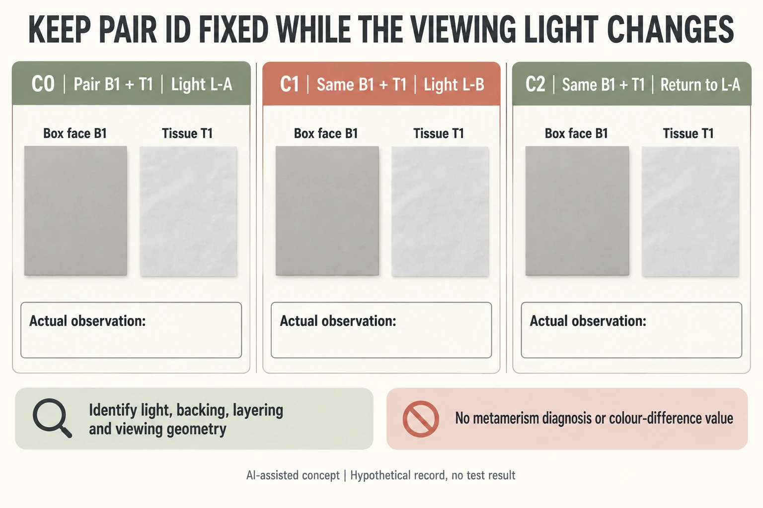
Retain one physical pair across three light checkpoints
Use invented box face B1 and tissue T1 at C0 under L-A, C1 under L-B and C2 back under L-A. These IDs are a comparison plan, not actual lamps, samples or observations. No deliberate material change is proposed between checkpoints, but identity alone does not prove the pieces stayed unchanged.
Scroll horizontally if columns extend beyond the view.
| Checkpoint | Physical pair | Viewing light | Record independently |
|---|---|---|---|
| C0 | B1 + T1 | L-A reference to identify | Initial actual relationship |
| C1 | Same B1 + T1 | L-B source to identify | Relationship under second condition |
| C2 | Same B1 + T1 | Return to L-A | Whether earlier relationship returns |
| Controls | Same actual arrangement | Separate identified sources | Backing, layers, orientation, handling |
Keep tissue layering, backing and relative geometry in the record. A newly folded sheet or changed finish would introduce another input, even if the familiar IDs remain on the forms. The neutral gray icons are uncalibrated identity symbols, not matching targets or a simulation of the two lights.
Record what the pair actually looks like at each checkpoint before naming a cause. A relationship that changes under L-B raises a cross-light design question; it does not establish metamerism without the relevant technical evidence. If a difference persists upon return, retain other material, handling or viewing explanations. The CSV supplies no color coordinates, spectral data, Delta E or tolerance, and this short comparison defines no exposure lifetime.
Download the packaging colour metamerism record (.csv). HYPOTHETICAL rows are invented examples. Use ACTUAL_BLANK for permitted project inputs; replace that row label only when recording actual facts. Empty evidence, observation and date fields mean unknown or not performed, never acceptance. Keep checkpoints and revisions separate.
Send the same physical pair, actual light identities, consistent arrangement and separate checkpoint observations before requesting a technical explanation. Packrivo coordinates independent suppliers. These records establish no supplier offer, service availability or MOQ exception; its published baseline is 500 pieces per product/design.