
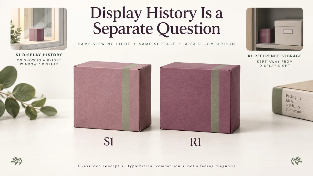
A printed gift sleeve can match its approved colour reference when produced and still look different after spending time on display. If that difference remains when the sleeve and reference are brought back under the same agreed viewing light, changing the lamp is not enough to explain it.
For a jewellery, candle or gift brand, this creates a separate purchasing decision. Initial colour approval establishes how a print looks at a particular point. Lightfastness concerns how its colour may respond to exposure over time. A package intended for prolonged display may need a durability discussion that a normal colour-matching review does not answer.
Changing the Viewing Light Is Different From Changing the Printed Material
Two unchanged printed surfaces can appear different under different lamps. The spectral composition of the illumination affects their appearance, even when neither surface has physically changed.
Light exposure introduces another possibility. Some colourants undergo photochemical changes that alter their ability to absorb and reflect light. The resulting fading or colour shift can remain visible after the print returns to its original viewing environment.
The Canadian Conservation Institute’s explanation of light deterioration distinguishes fading of light-sensitive colours from other forms of material deterioration associated with ultraviolet radiation and heating.
Consider the difference between two observations:
A cream package looks warmer under a shop lamp than under the agreed print-viewing light. When the unchanged package returns to the original light, its earlier appearance returns. That is a viewing-condition issue.
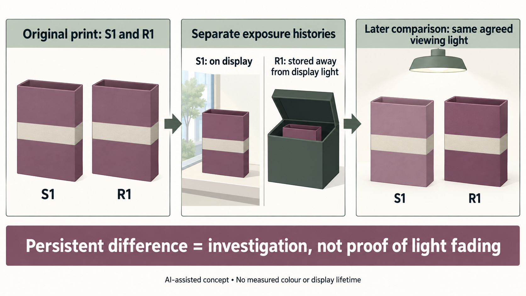
A coloured sleeve looks paler than a retained reference after spending time on display. When both pieces are compared under the same agreed light, the difference remains visible. The pieces may no longer have the same material state.
The second observation raises an exposure-durability question. It does not establish light fading as the cause merely because the displayed piece looks paler.
Visible Light Can Cause Fading Even When UV Is Reduced
Ultraviolet radiation is not the only part of an exposure environment that matters.
The Canadian Conservation Institute explains that visible light can cause sensitive colours to fade. Ultraviolet radiation contributes to deterioration such as yellowing, chalking and weakening of materials, while infrared radiation primarily creates heating effects. These processes can overlap.
Consequently, removing ultraviolet radiation does not eliminate the possibility of visible-light fading. A UV-filtering window film, protective glazing or proposed surface treatment should not be described as making every printed colour resistant to display exposure.
Different colourants also have very different sensitivities. Some remain comparatively stable under exposure conditions that visibly alter others. A broad statement such as "printed colours fade in sunlight" does not establish how a particular ink system will behave.
A useful manufacturer example comes from Nazdar’s technical sheet for fluorescent pigment powders. It warns that these specialty fluorescent colours fade quickly under ultraviolet exposure and are not rated for outdoor durability.
That warning applies to the described fluorescent pigment products. It cannot be extended to every conventional process ink, spot colour, pigment-based system or finished gift-box print.
The appearance of a printed package also depends on more than the colourant. Its paper, board, ink vehicle, coating and other surface layers contribute to what the viewer sees. A yellowing substrate, altered coating or deteriorating printed surface may change the overall appearance without the visible difference being attributable solely to colourant fading.
This distinction matters because the corrective question depends on which part of the construction has changed.
A Hypothetical Display Sleeve and Retained Reference
Imagine a small candle brand choosing a coloured paper sleeve for a gift carton.
This is an entirely hypothetical example. There are no measured samples, reported exposure periods, laboratory results or observed fading rates.
The brand initially reviews its proposed printed sleeve under an agreed viewing light and accepts the intended colour. Two sleeves from the original printing job are identified:
- S1 is used on a package placed in a retail display.
- R1 is retained away from the display light as a reference.
Later, the displayed sleeve is returned for comparison. Both S1 and R1 are placed side by side under the same agreed viewing light, with their viewing orientation, background and surface condition considered.
Suppose S1 still appears paler than R1.
The immediate conclusion is limited but useful: the two physical pieces no longer appear equivalent under that comparison condition. The difference cannot be explained simply by saying that one is currently under the shop lamp and the other is under the original viewing lamp, because both are now being examined together.
Exposure-related colour change becomes a reasonable investigation question. It is not a proven diagnosis.
The brand still needs to consider whether the pieces were genuinely comparable at the beginning, whether their storage and handling differed, whether one experienced contamination or abrasion, and whether changes to the substrate or finish contributed to the appearance.
Even the retained R1 is not necessarily an unchanged baseline. Keeping it away from display light does not prevent every possible ageing process.
The next decision is therefore not automatically to reprint S1 in a darker shade. It is to establish whether the proposed printed construction can retain the desired appearance under the intended display conditions.
A darker starting colour could improve or worsen the final appearance depending on the actual behaviour of the material. Nothing in this hypothetical comparison supports predicting that outcome.
Lightfastness Evidence Must Relate to the Intended Printed Construction
Lightfastness is a response to exposure, not simply an initial colour coordinate or an approved swatch.
The ISO 12040:1997 catalogue entry identifies a standard for assessing the lightfastness of prints and printing inks using filtered xenon-arc light. ISO lists the March 1997 edition as published and last reviewed and confirmed in 2022.
Its public catalogue information establishes that print lightfastness has a distinct technical assessment framework. The complete method is not freely available from that listing, and the listing alone does not provide testing conditions, approval thresholds or predictions for retail packaging.
For a proposed display sleeve, a responsible printing or material specialist should establish whether suitable exposure evidence exists for the relevant print system and construction.
An ink-related result obtained on another substrate cannot automatically establish the behaviour of a finished sleeve with a different coating or lamination. A result for an uncoated laboratory print does not necessarily answer what happens to a finished, converted package.
The exposure conditions and the criterion used to evaluate colour change also matter. A controlled accelerated-exposure result is evidence under its declared conditions, not an automatic conversion into months or years of acceptable appearance in a particular shop.
The brand’s practical requirement should come first: does the sleeve need to maintain a close colour relationship with another package throughout an extended display period, or is the principal requirement its appearance during initial presentation and unboxing?
Those two uses may justify different sourcing discussions. Neither creates a universal acceptable fading percentage or required lightfastness grade.
Initial Colour Accuracy Cannot Substitute for Exposure Durability
A printer can supply a candidate that matches the physical reference closely at the initial review stage. That is useful evidence for the initial appearance decision.
It does not establish that the printed colour will remain within the same visual relationship after exposure.
Likewise, choosing a tighter Delta E tolerance does not establish the future durability of the colourant. A colour-difference calculation compares specified colour data; it does not, by itself, describe how those data may change after light exposure.
This is why the physical colour reference approval process and an exposure-durability review have different purposes. The first establishes what the printed package should look like when assessed against its agreed reference. The second considers whether that intended appearance is suitable for the package’s expected exposure history.
A similar distinction applies to uneven appearance on a newly formed printed panel. That question belongs to the formed solid-panel review before any exposure-related explanation is assumed.
If a gift sleeve will be displayed for extended periods, the brand can ask the proposed printer to identify the ink, substrate and finish combination and explain what relevant durability evidence can be provided. The brand can also reconsider the intended display arrangement where sustained colour appearance matters.
Reducing exposure may reduce an exposure-related risk, but no particular UV filter, laminate, pigment family or display adjustment should be treated as an unconditional guarantee.
The Buying Decision Depends on the Expected Display
A candle carton opened shortly after delivery and a decorative gift package kept in a shop window may have very different exposure histories.
Both need an acceptable initial print appearance. Only the second necessarily raises a prominent question about appearance over sustained display, although exposure may matter in other distribution and use environments as well.
When a print looks different after display, return the relevant physical pieces to the same agreed viewing condition before deciding what the observation means.
If the difference disappears, the immediate problem may concern viewing conditions rather than a lasting change to the print.
If a difference persists, retain the possibility of exposure-induced change while keeping alternative material, production, storage and surface explanations open. A specialist assessment may be necessary where identifying the mechanism matters to the decision.
Packrivo can help coordinate sourcing questions about proposed ink systems, substrates, finishes, display expectations and evidence from a printing partner. Packrivo does not claim to perform lightfastness testing or certify a package’s display lifetime. Any specific technical method, result or acceptance requirement must be established by the responsible parties.
A colour approved under a viewing light is an initial appearance decision. A colour expected to withstand continuing exposure is a separate material-durability decision.
Record both histories before treating a retained piece as the baseline
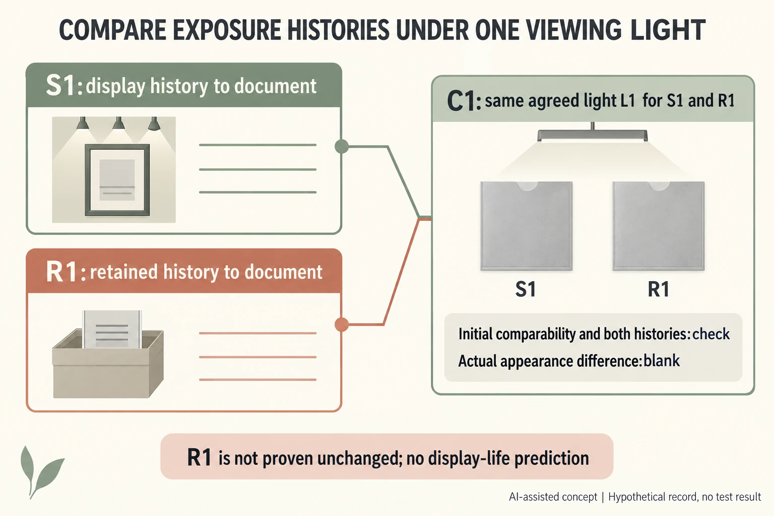
For invented specimens S1 and R1 from nominal print batch PB-H, plan S1 for display and R1 for retention away from that display light. Later comparison C1 puts both under the same agreed light L1. No initial equality, exposure history or physical difference has actually been verified.
Scroll horizontally if columns extend beyond the view.
| Record | Planned identity/state | Open evidence |
|---|---|---|
| Initial PB-H | S1 and R1 | Actual initial comparability |
| S1 | Display history | Light, storage, handling and surface history |
| R1 | Retained history | Conditions and possible aging; not assumed unchanged |
| C1 | Both together under L1 | Actual difference and relevant viewing conditions |
Keep print construction, ink/substrate/finish, initial references and both actual histories attached. A retained label is a role, not proof that the specimen never aged. If the pieces were different at the beginning, a later mismatch cannot be attributed to display exposure alone.
The neutral symbols depict no fading or measured color difference. Use the same agreed viewing condition for the later physical comparison while keeping alternative production, handling and material explanations open. The CSV supplies no exposure hours, lux dose, Delta E, grade, accelerated-test conversion or acceptable display lifetime. A persistent difference would prompt the appropriate print/material investigation, not automatically a darker reprint.
Download the packaging print lightfastness record (.csv). HYPOTHETICAL rows are invented examples. Use ACTUAL_BLANK for permitted project inputs; replace that row label only when recording actual facts. Empty evidence, observation and date fields mean unknown or not performed, never acceptance. Keep checkpoints and revisions separate.
Send actual initial references, both specimen histories and the same-light comparison before seeking construction-specific durability evidence. Packrivo coordinates independent suppliers. These records establish no supplier offer, service availability or MOQ exception; its published baseline is 500 pieces per product/design.